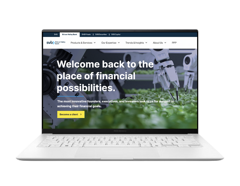
Bancs
Bancs
Overview
Employees of SVB currently access all the HR related documents, policies or request for time off by accessing various sharepoint sites and had to bookmark sites which user frequently revists. Our solution is to have a one stop solution for employees of SVB to access all the HR related information / documents/ tasks from one place instead of them accessing various sites.
-
Planned to launch the MVP by Nov 2022.
-
The initial launch is targeted for the employees working in US and Canada regions.
-
Implementation of the HR portal will be done by using servicenow.
Scope
Focused on out of the box implementation of servicenow.
My Role
Product Designer, Product Strategy, User Research, Visual Design, Prototyping & Testing, Information Architecture
Understanding the problem
When the usability of a website isn’t smooth and intuitive, users tend to get frustrated and leave the website. This was the problem with the current website.
The internal employees of SVB were getting frustrated with the current setup as they had to access different sites for whether to create a ticket or to claim rewards. The navigation was not intuitive due to which user had to go through all the sites to complete a particular tasks which intern resulted in more number of clicks or remembering the flow.
The Goal
To make the site a smoother experience, less cluttered and confusing, prioritizing what information needs to be shown and reducing the effort needed to complete the task.

To provide an engaging and interactive user experience so that the user doesn’t leave the website in frustration.
Interviews
As a sole designer on the team, I conducted an hour long remote meeting with an total of 8 participants, combination of stakeholders and seasoned employees of SVB to understand the goals of the product.
Stakeholder Interview
-
What is the goal of the HR portal?
-
Who do you think are your primary & secondary users?
-
Is your main focus only on the US and canada audience or are you planning for any other locations?
-
Do you have any preference for the visual appeal of the website?
-
Was there any user research conducted before?
User Interview
-
How often do you use the HR portal?
-
What tasks do you generally perform?
-
What do you feel when you see the homepage of the current setup?
-
What are you pain points in the existing design?
-
How do you create ticket/ claim rewards / enroll in benefits in current setup?
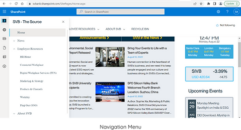
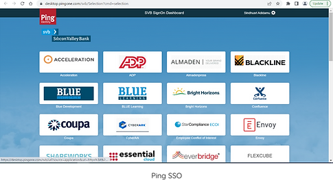
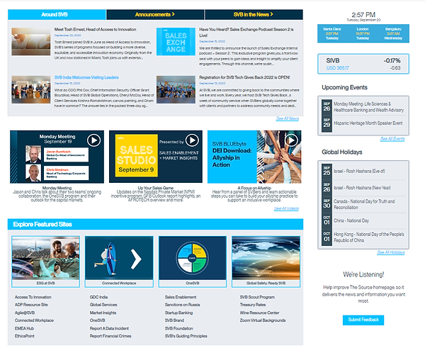
Old Normal
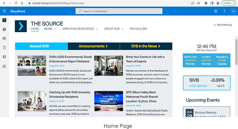
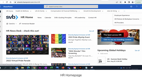
Homepage
Navigation Menu
Ping SSO
HR Homepage
Interview Analysis
Grouped together similar findings to identify patterns and trends in the data, which enabled me to develop key findings for improving the user experience and content of the website.
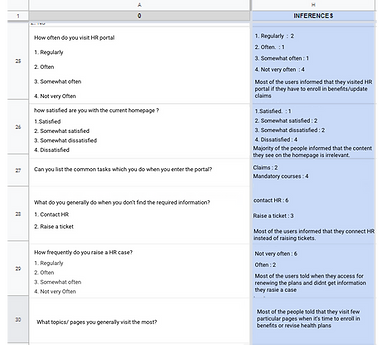
A snippet of data from the interviews
Key findings
Major Personas to focus where finalised ie, employees and managers of SVB, would be using this portal.
Major Personas to focus where finalised ie, employees and managers of SVB, would be using this portal.

The focus was on mobile first design approach as it would help us focus on the content more.
The focus was on mobile first design approach as it would help us focus on the content more.


Users found virtual assistant as a huge plus point.
Users found virtual assistant as a huge plus point.


-
Need to focus on minimalist design
-
Focus on the content which is actually important to the user
-
Need to focus on minimalist design
-
Focus on the content which is actually important to the user

Not to replicate the content from share- -point to servicenow portal.
Not to replicate the content from sharepoint to servicenow portal.

Impact
Initially, the stakeholders were not keen on the idea of additional research due to time constraint. The MVP was set to launch in November and we were in mid-July when I made the recommendation. Fortunately, they agreed for some research to be done so that it would help me with ideation and also finalizing the IA.
Constraints
Time Constraint
Understanding Platform Limitations
Understanding out of the box functionalities
Lack of Design Files for Portal Design
Managing Site Navigation
Limited Customizations
Allowed
Identifying Use Cases
Next, I worked on our use cases and user stories. Describing the type of user, what they want and why helped in simplifying and understanding the requirements.
It also helped combat the natural tendency to design for ourselves (or our stakeholders) rather than designing for our target audience.
Some use case examples are shown.
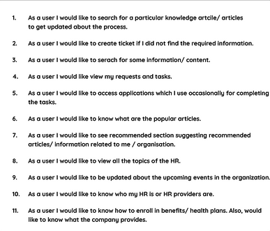
A small snippet of few of the use cases
Challenges
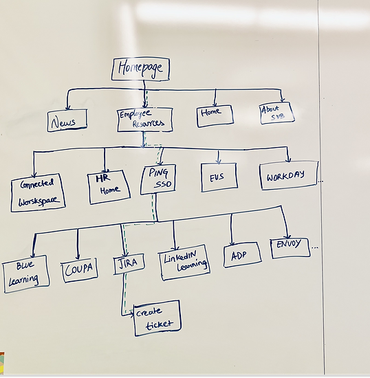
Identifying the information Architecture
The normal way was accessing the information was traversing through various sites and current setup had huge chunks of data to segregate. I decided to review the content which is present on the sharepoint and have listed down all the elements from the sites and classified them as topic and subtopic. This list included of following below items -
-
Headings & subheadings
-
Texts
-
URL Links of different pages
-
Documents
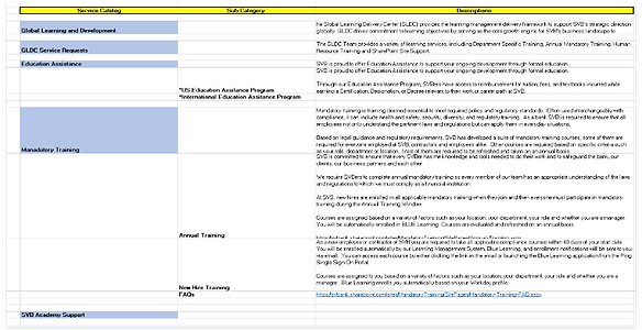
A snippet of the data
Research Process
I’ve worked with the stakeholders (Page owners & Business decision makers) to finalize a list of cards and narrowed it down to 7 categories and 59 cards. Due to a time constraint, we simultaneously conducted open and closed card sorts in Optimal Workshop on a total 20 participants. Prior to launching the study, I piloted the the card sort to establish a baseline.
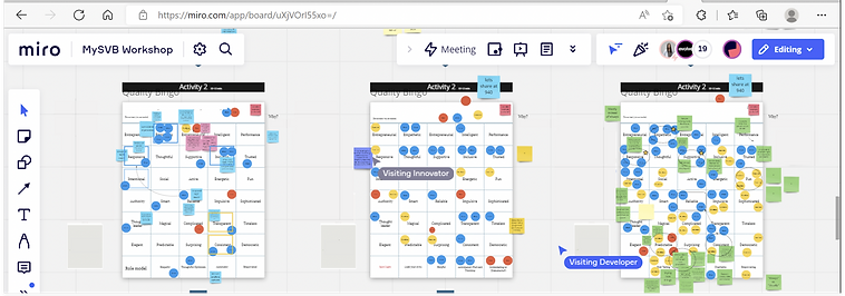
A snippet of the data from the workshop conducted
Why?
-
I wanted to conduct open card sort to understand how associates grouped and categorized the cards.
-
I also wanted to leverage this to understand how many categories were appropriate.
-
As for closed card sorts, I wanted to get feedback on how users group the cards given within a pre-decided structure.
-
The result from closed card sorts were compared with the open card sort.
Results
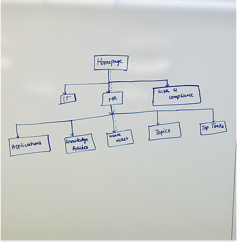
I had a working session to synthesize the findings from Optimal Workshop. The final navigation structured contained 7 categories, 2 of which were renamed and 2 to 3 sub-menus were included in 2 of these categories.
Navigation Menu
Designed 4 layouts in few days and have presented the designs to stakeholders and users, based on the feedback received - implemented the design in servicenow portal with the help of tech team. Below are the representation of the layouts -
Design 1
Design 3
Design 2
Design 4
Impact
All the 4 navigation designs were presented in front of stakeholders and users and later was drill down to two ie, Design 3 and Design 4, where we performed the test among the two navigations and we found that 15% users liked design 4 more than the design 3 so we went ahead with the design 4 for implementation.
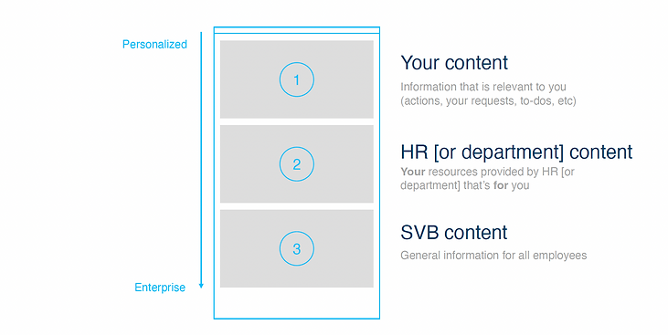
Prioritizing the content on homepage
After the initial meeting, I designed a layout which focuses more on content structure of the portal and created a sample layout about how the content would be segregated and shared it with all the stakeholders to get a feedback on the same.
Once the content structure was approved I started working on designing the layout of the portal and share the below two designs with all the stakeholders.
Design 1
Design 2
Impact
When the content structure was shared for the portal the stakeholders were pleased with it. Initially both designs were shared with the stakeholders , Some stakeholders liked design 1 and some liked design 2. but were unable to give a go for the design. Later I tested the designs with few users who were potential users for the portal, they like design 2 more than the design 1 as it was easy to use and the users informed that they were able to figure out what exactly the design was communicating in design 2 than design 1. The same feedback was shared with the stakeholders and later was agreed to go ahead with design 2 as users liked it.
Finding Focus with Design Strategy
Simplifying User Flows
Once I had a good understanding of the problem space, I jumped onto brainstorming and idea generation. It was quite clear from reserach that users wanted more streamlined process with simple user flows where they need not spend much time learning the navigation.
A Snippet of the user flow for creating ticket from old normal
Implementing AI Search
Using smart search in portal where user feels more intuitive and it would also help the user to make the decision faster.
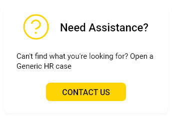
Streamline the content to be displayed to the user
Most of the users see a lot of content irrelevant to the user being displayed which would distract the user attention when accessing the site. The focus was on to show the content relevant to the users so that the distraction would be less and user can focus on completing the task.
A Snippet of the content shown to users when they check HR home
Choosing simple text and jargons
Users must be aware of what they are seeing and we must try to eliminate unnecessary distractions or confusion by using trendy texts or jargons. Must try to maintain simple text so that user would understand the content of the page clearly.
A snippet showing wait time
Giving shape to the strategy - workflows and wireframes.
Streamline the User flows
This still remained my priority. I needed to provide an experience where user does not have to learn navigation before accessing the site. I wanted to have flatter hierarchy which allows users to complete their tasks and find what they are looking for.
A Snippet of the user flow for creating ticket on new portal
Creation of Ticket ( support)
Users were unaware of the support articles and called support in absence of any help. Our proposal was to integrate the support search with the current search functionality.
A Snippet of ticket creation when user searches for any information
Wait Time
We use the wait time to inform users when the portal is trying to fetch the content. Since I had to work using out of the box constraint gave advice to show an indicator with 3 dots showing which indicates that it is trying to fetch the data or loading.
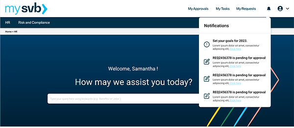
Notification
Suggested to add notification icon to notify users about the updates related to the user for their action or any task progress.
Virtual Chat Assist
Implementing chatbot will help users to get help faster.
A snippet showing notifications
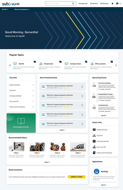
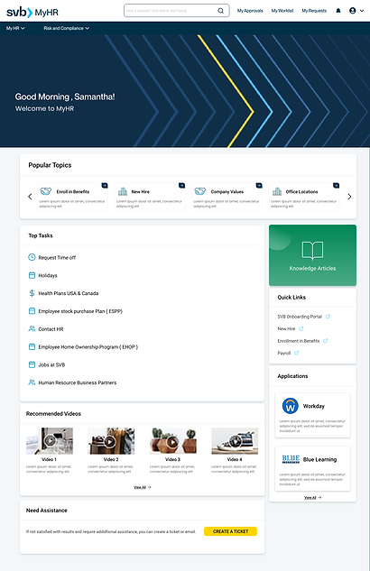
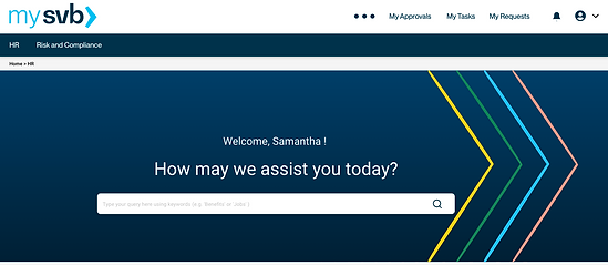
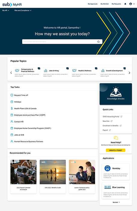
Final Design of the homepage
After repeated discussions and feedbacks , below is the final layout designed and approved by the users and stakeholders.
Impact
The Iterated designs where much liked by the users and stakeholders as it is simple to use . I have designed using the SVB guidelines and have maintained the consistency across the applications of SVB.
Designs
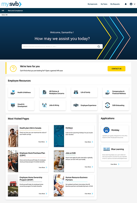
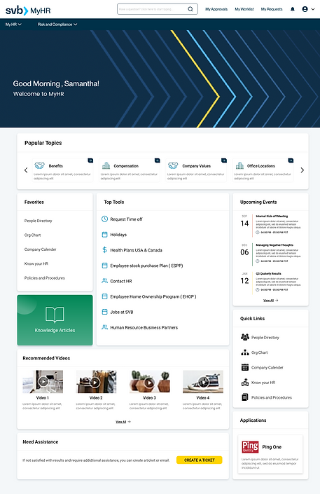
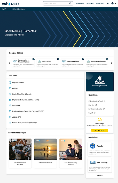
After the finalization of the content structure and approval of a layout i started working on iterating the layout. Below, one can see the iterations done to reach the final layout for the homepage of the HR portal. This layout also focuses on the analytics pulled from the current existing webpage ie, sharepoint .
Below are the representations of iterations of homepage designs for the portal -

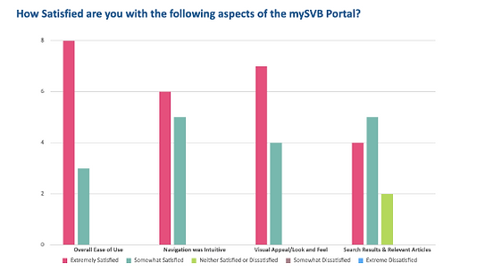
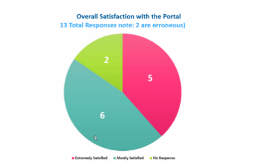
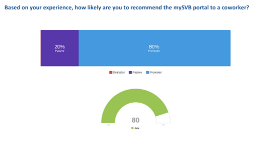
User Testing
I conducted a testing on small group of end users where we piloted the portal with 10-15 users and shared a survey with open ended questions with rating from 0 to 9 where 0 being not satisfactory and 9 being extremely satisfied.
-
How do you feel about the homepage?
-
Do you think user would perform anymore tasks apart from the mentioned?
-
What would you like to improve on the portal?
The main agenda of conducting survey was to make sure that the goal and the vision of why we need the portal at first place has been met. I have used simple jargons and text for the users to feel more connected and understand the content of particular sections.
Current Implementation
Key Learnings
-
There is no set way to approach a problem. It is important to take steps according to what makes sense at the moment, and it might take going back and forth multiple times in order to figure out how to proceed.
-
Prioritization of information is really important, both from a user and a business point of view.
-
Stakeholders can have valuable information regarding their users, details that we might not know. So it is important to ask for information from their side.
-
It is not just great content, but it is also the presentation and an engaging UX that is key for getting users to stay longer on the page.
-
Figuring out the use cases plays a huge part before jumping into the design, ensuring that we don't miss any cases while designing.