Overview
-
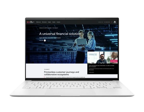
Bancs is an SAAS product for which TCS itself is the product owner. There are various financial organizations like old mutual wealth, Deutsche Bank, Continental Bank etc., which uses this solution.
-
When the usability of the application isn't smooth or intuitive enough for the users that's when the users start to feel annoyed or frustrated when accessing the application, the same was happening with Bancs application. Our team’s responsibility was to enhance the experience of the application by improving usability and reducing clicks to complete the tasks which users generally performed along with modern UI which aligns with latest design trends.
Objective
The Main objective of redesigning the bancs application was to
-
Improve the usability of the application
-
To modernise the application for better look and feel.
-
To Improve accessibility of the application
Goals
-
To reduce ping pong in the application
-
To create a holistic valuable and user centric experience.
-
To modernise the application for better look and feel
-
To Improve the visual representation of data.
Role
UI and UX Design, Prototyping, Updating the Design System, Coordinating with Developers and PMs, Optimizing User Flows
Team
Myself, Rahul ( UI & UX designer ), Shesh ( Senior UX Manager ), Product managers , Developers.
Design Process

I understood the user patterns with help of user research and affinity mapping helped me group data according to common theme.
Research

Presented a subset of design system after multiple iterations and feedback, got it approved which bought consistency across application.
Design & Iterate

NPS score improved from 56 to 82
Testing
User Research
Contextual Enquiry
I along with my teammate Rahul have conducted a contextual enquiry with around 8 users out of which 4 were power users and 4 new users who were using the application.
We shared few task scenarios and silently observed how users approached the task. Our main intention was to -
-
Understand the user flow
-
Understand and identify the pain points users face when trying to complete the given task.
-
To get a fresh perspective on the UI of the application
This study helped us to prioritize and gain consensus on the most important problems users were facing which we shared to our UX manager.
User Persona
Based on the interviews and research We categorized users into 4 types ie,, Advanced users , Well informed users , Middle layer users sers and New users. Each participant will be assigned specific roles within the system, which reflect their participant status and desired functionality.
Research Insights
Based on the interviews , we understood and listed user pain points and needs.
-
Navigation can be improved
-
Inconsistency in usage of colors makes me feel annoyed.
-
I cannot see the complete profile of the user/account
-
Data representation can be improved
-
Simple usage of nouns
Challenges
Based on the research insights we have listed down few challenges of the existing product.
-
Veteran users are hesitant to move away from old application
-
Application was huge with redundant duplicate data.
-
New users find it annoying and tedious while accessing the application.
-
Takes minimum three screens to complete a simple task.
-
Outdated design system.
Brief given for the user groups
After identifying the user personas, We created a list of requirements based on the research and feedback received and below image represents the requirements and also the feedback for redesigning the application
.png)
The Structure Should Have
Information Architecture
After identifying personas and user interviews, once of the major feedback was navigation needs to be improved. To understand the information architecture we outlined the current/ existing information architecture and found that the menu was huge and redundant. We came up with the idea to simplify the information architecture of the application and conducted card sorting with different user groups.
-
Members from each user group presented their views with reasoning using card sorting method.
.png)
-
All the sorted cards pasted on different sheets were presented together to expert group and UX review group for further detailed review
.png)
-
Detailed review simplified the navigation structure. While mapping all the available content with the sorted navigation parameters, the review team arrived at new information architecture, which has less number of primary and secondary navigational links with simple and shorter terms.
.png)
-
Based on the detailed UX review over the outcome of card -sorting the information architecture is defined. The navigation architecture ( Primary, Secondary & Subsidiary ) created based on the following criteria.
.png)
Navigation before and after research
-
Before creating information architecture
.png)
-
After creating information architecture
.png)
Wireframes
After all the analysis and discussion about the user flow, I sketched the layout of each screen and created a UI element library to speed up our design process.
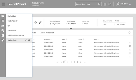
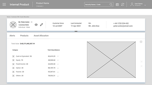
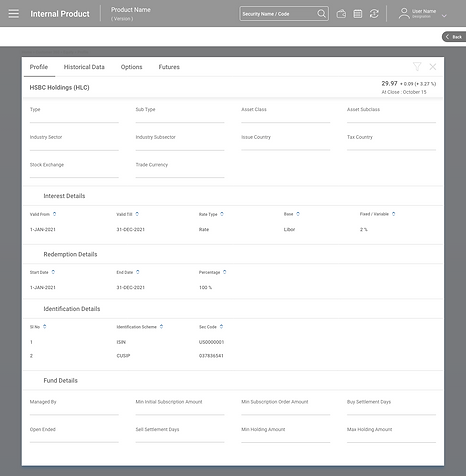
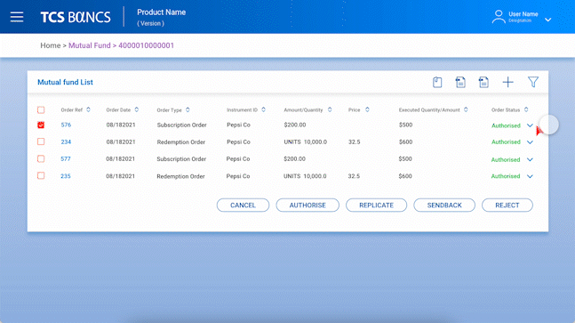
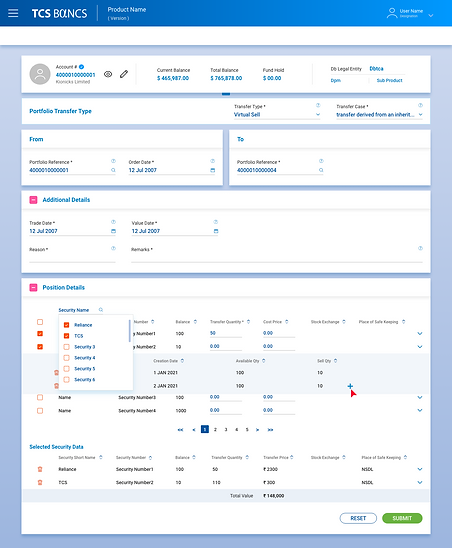
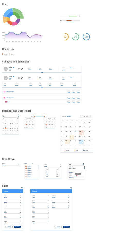
Representation of tabular data
Users were bombarded with information upfront which caused confusion which lead to human errors while performing the tasks. We tried optimising the data so that user would be provided with only the necessary data and also made sure that the user interface is not cluttered.
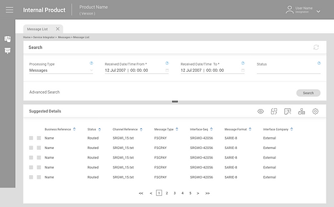
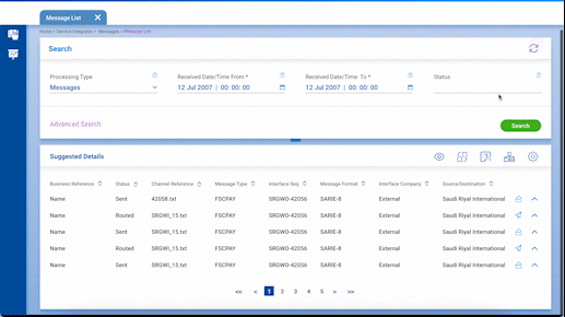
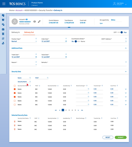
Key Screens
Collapsed State
Expanded State
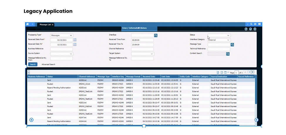
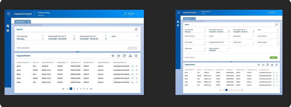
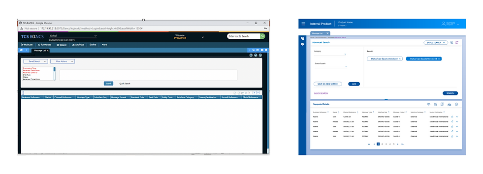
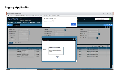
Legacy Search V/S Advanced Search
In Legacy application, Users had to perform extra clicks to get the result. We simplified the process by reducing the clicks which improved the experience of the user.
Intuitive Interaction
Based on the interviews and research insights, We designed the application focused more on the user needs and pain points by improving and redesigning the current application more user centric.
New Screen

Release File
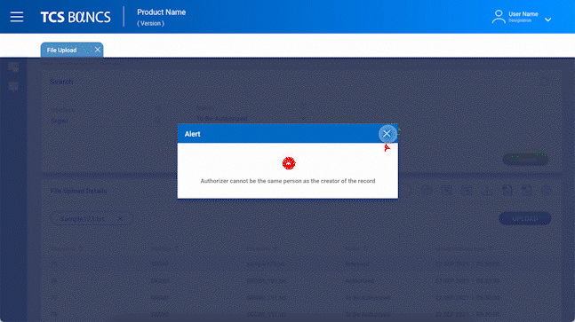
Upload File
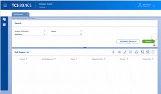
Bulk Resend
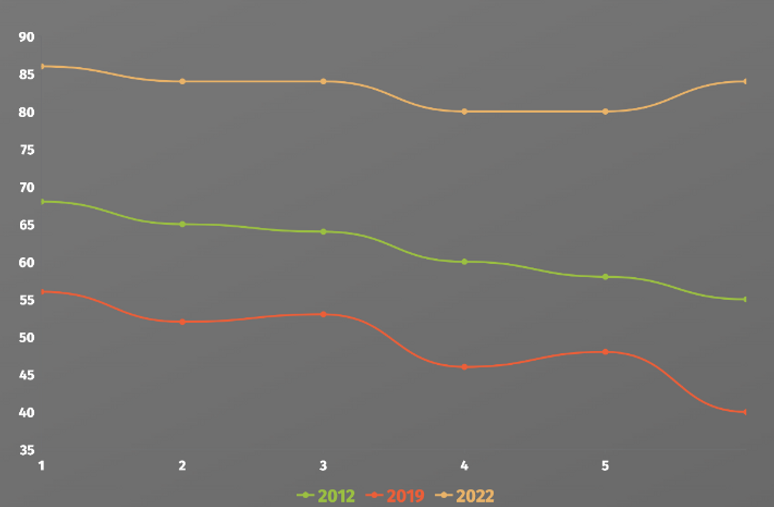
Data Representation
Other Designs
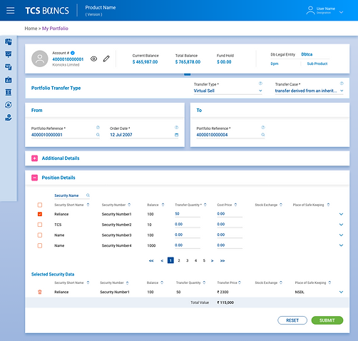
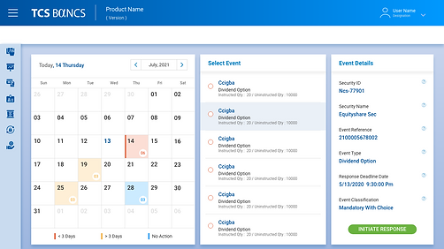
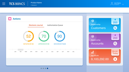
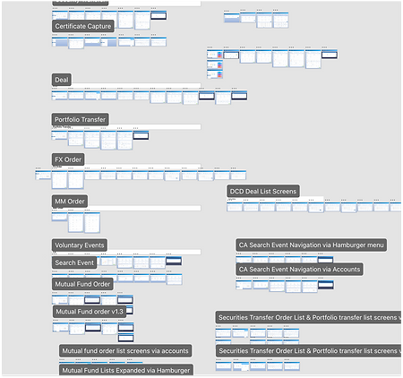
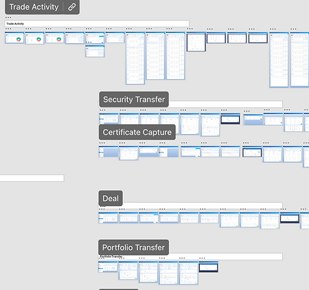
More than 250 screens where designed and were signed off. We tried optimizing the user flows by reducing number of clicks for the completion of tasks.
Design System
-
There were many UI changes done on the application to improve the user experience while accessing the application. All those changes were documented and I created a design system by thinking all the different ways in which we can solve the user problem.

User Journey
By making those changes users are able to accomplish tasks and find what they're looking for in a fewer clicks and improved efficiency by 30%. NPS score improved from 56 to 82.
Key Learnings
-
Power of diverging as a team and then coming together to share our thoughts. To save time, we divided the work and created our designs and iterations for each feature. We then came together to share our ideas. This opened up ideas that one or the other of us would've never come up with before.
-
Collaborating with multiple teams. I had to constantly coordinate between Developers and PMs for data asks and to make sure my design was feasible.
-
Balancing business and user needs. The revamp pushed me to brainstorm ways in which we could incorporate the business needs while not taking away from a smooth experience