About CNA Insurance
CNA Insurance is a leading U.S.-based provider of commercial property and casualty insurance, offering a wide range of specialized coverage for businesses of all sizes, including sectors like healthcare, construction, and professional services. It is known for its strong underwriting, risk management expertise, and commitment to helping clients manage complex risks effectively.
Problem Statement
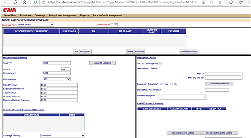
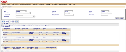
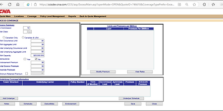
Underwriters have complained about the current application where they don’t like its archaic and inefficient digital interface. This has led to a noticeable decline in user engagement and growing frustration among employees due to cumbersome UI.
User Experience Issues
-
Overwhelming Display :
-
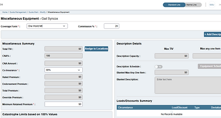
The dense table structure and nested rows prevent easy scanning or sorting of the information.
Excessive Pagination :
-
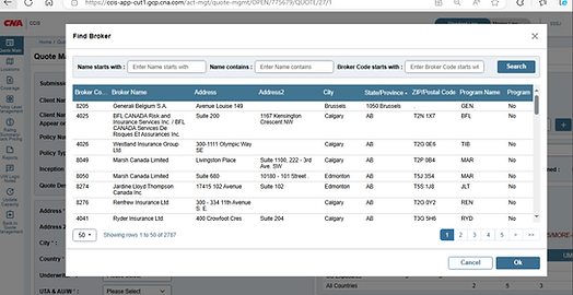
Poor experience navigating through hundreds of pages.
-
-
Search and Filter Limitations :
-
Minimal filter options, no live results or common sense suggestions. No message on an unsuccessful try or empty results (i.e., doesn't toast or warn).
-
-
Redundancy and Repetition :
-
Repetitive labels such as QUOTE DATE QUOTE DESCRIPTION, etc., for each record introduce noise. Doesn't require all that markup though, could be cleaned up and put into a more expandable/collapsible layout.
-
User Interface Issues
-
Outdated Visual Style :
-
It’s a relic of a 2000s system, with boxes laid flat, ancient fonts, and minimal design. No branding or easy visual references like icons, color combinations, or sections.
-
-
Poor Alignment and Spacing :
-
Inconsistent padding/margins, not consistent between design; feels cramped. The form fields and data rows just sort of blur into each other without adequate visual breaks.
-
-
Non - Intuitive Controls :
-
Action buttons i.e., “search, reset” are tiny, greyish, unremarkable, visually non-differentiated. No Direct-Reads or FAQs for Dropdowns, and Text Fields without Tooltips or Contextual Help.
-
-
Low Accessibility :
-
No visual indication of focus states or keyboard navigation. Color is not necessarily accessible to someone with a visual impairment (i.e., low contrast text is used).
-
Scope of Work
-
UI & UX Design : Revamping old designs to modernised one by following the standards.
-
Accessibility Improvements : Ensuring that we are WCAG compliant.
-
Usability Enhancements : Making navigation more convenient so that users can close up the tasks quickly.
-
Information Architecture : Redesigning the way content was organized for better clarity, discovery, and comprehension.
-
Design Testing : Making sure that the constructed screens are matching with the design layout and maintained things uniform in terms of look and feel across the UI.
Project Details
-
Role : User Experience Designer
-
Tools Used : Jira, Adobe XD, Zeplin
-
Team Size : 2 UX Designers, 1 Project Manager , 2 Business Analysts , 108 Developers
-
Platform : Web Application
Research Insights
User research was conducted by Rule Mining Team. We utilized their insights to shape and support our design approach, ensuring that our solutions aligned with user needs and expectations.
Challenges Faced
-
Underwriters were resistant to change, preferring the legacy design over the proposed new design.
-
Design approvals were getting delayed.
-
Multiple iterations were required to finalize layouts and secure stakeholder approval.
-
Stakeholders were difficult to convince, requiring extensive explanation and justification for each design decision.
Old Design Snippets
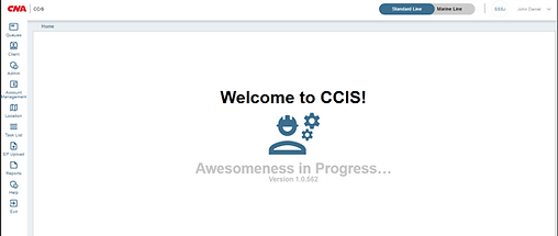
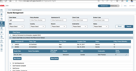
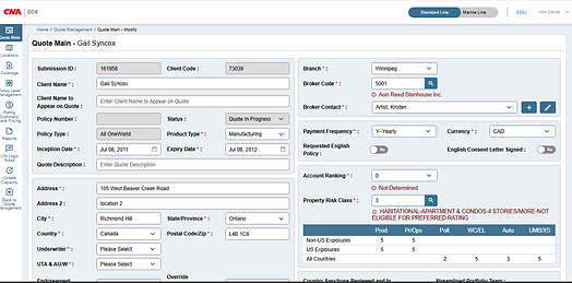
New Design Snippets
Modernizing 300+ Screens
Around 300 screens were redesigned in the legacy portal revamp, covering complete user journeys, workflows, and features to deliver a consistent and modern user experience
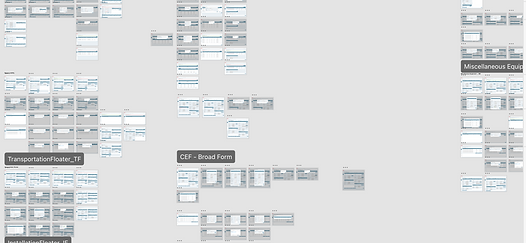
A Snippet of screens worked on in Adobe XD
Design System Modernization
As part of legacy portal revamp, we enhanced and extended the existing design system to support the redesign of over 300+ screens. The goal was to create a consistent, modern and user - friendly interface that aligned with usability practices and accessibility standards.
Key Enhancements
-
Layout and Structure :
-
Replaced dense, table-heavy layouts with modular, card-based structures.
-
Introduced clear content grouping and logical hierarchy to improve readability and scanability.
-
-
Typography Update :
-
Updated from Arial to Avenir for improved legibility, visual clarity, and a more modern aesthetic.
-
-
Visual Design & Branding :
-
Standardized font sizes, icons, and components for a unified visual language
-
Applied a refreshed color palette with purposeful use of contrast and whitespace.
-
-
Reusable Components :
-
Ensured consistency and reusability across multiple modules and workflow.
-
Built scalable UI components like dropdowns, tag buttons, action icons, and accordions.
-
-
Improved Usability :
-
Enhanced form fields, spacing, and call-to-action buttons.
-
Reduced visual clutter and made interactive elements more discoverable.
-
-
Navigation Redesign:
-
Replaced horizontal top menu with a fixed sidebar navigation for easier access to key sections.
-
Included icons and labels to support quicker recognition and navigation.
-
A Video Snippet of legacy application used by underwriters of CNA
A Video Snippet of modernized application which will be used by underwriters of CNA
Impact
-
Enhanced User Experience
-
Streamlined workflows and modern UI elements made the platform more intuitive and user-friendly.
-
-
Increased Efficiency
-
Overall performance increased 45-55% and underwriters productivity increased 100%
-
-
Consistency Across Screens
-
Standardized components and styles delivered a cohesive experience across 300+ redesigned screens.
-
-
Positive Feedback from Users
-
Underwriters and internal teams responded positively to the updated interface, citing improved clarity and ease of use.
-
Learnings
-
Some stakeholders were hesitant to move away from the old design because they were used to it. Regular communication, showing prototypes, and sharing clear reasons for the changes helped gain their trust and approval.
-
Small tweaks can create big wins, Simple changes like better spacing, clearer fonts, or more obvious buttons went a long way in improving the experience.
- Spending time understanding what underwriters actually needed helped us design something that worked for them—not just what looked good on screen.
- Checking developed screens against designs throughout the process helped us catch issues early and make better decisions along the way.